Yerba Buena’s Pre-Roll 5-Pack
PACKAGE DESIGN • TYPOGRAPHY • MATERIAL SOURCING • PRODUCT PHOTOGRAPHY
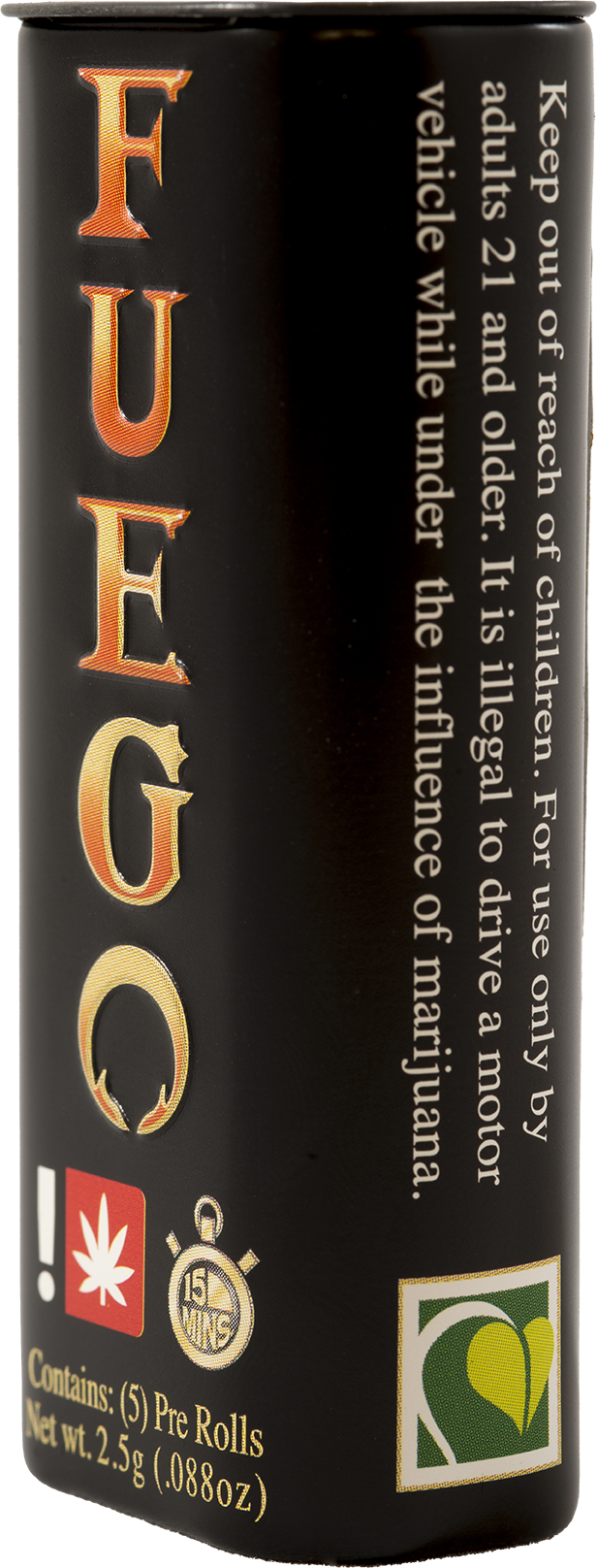
FUEGO - (Spanish for fire) was used because ‘fire’ is slang for good weed. The use of the Spanish word is inline with the company’s brand Yerba Buena, which is Spanish for ‘Good Herb’.
The Project:
Create a package for a cannabis farm to distribute their pre-rolled cones that durable, easy-to-use, and 100% recyclable.
Typography & Package Design
The unique Fuego font was created from an existing company’s display font. The serifs were sharpened to create the appearance of flames.
The gradient was created to simulate the range of fire’s colors. Brand consistency was maintained by using existing company colors.
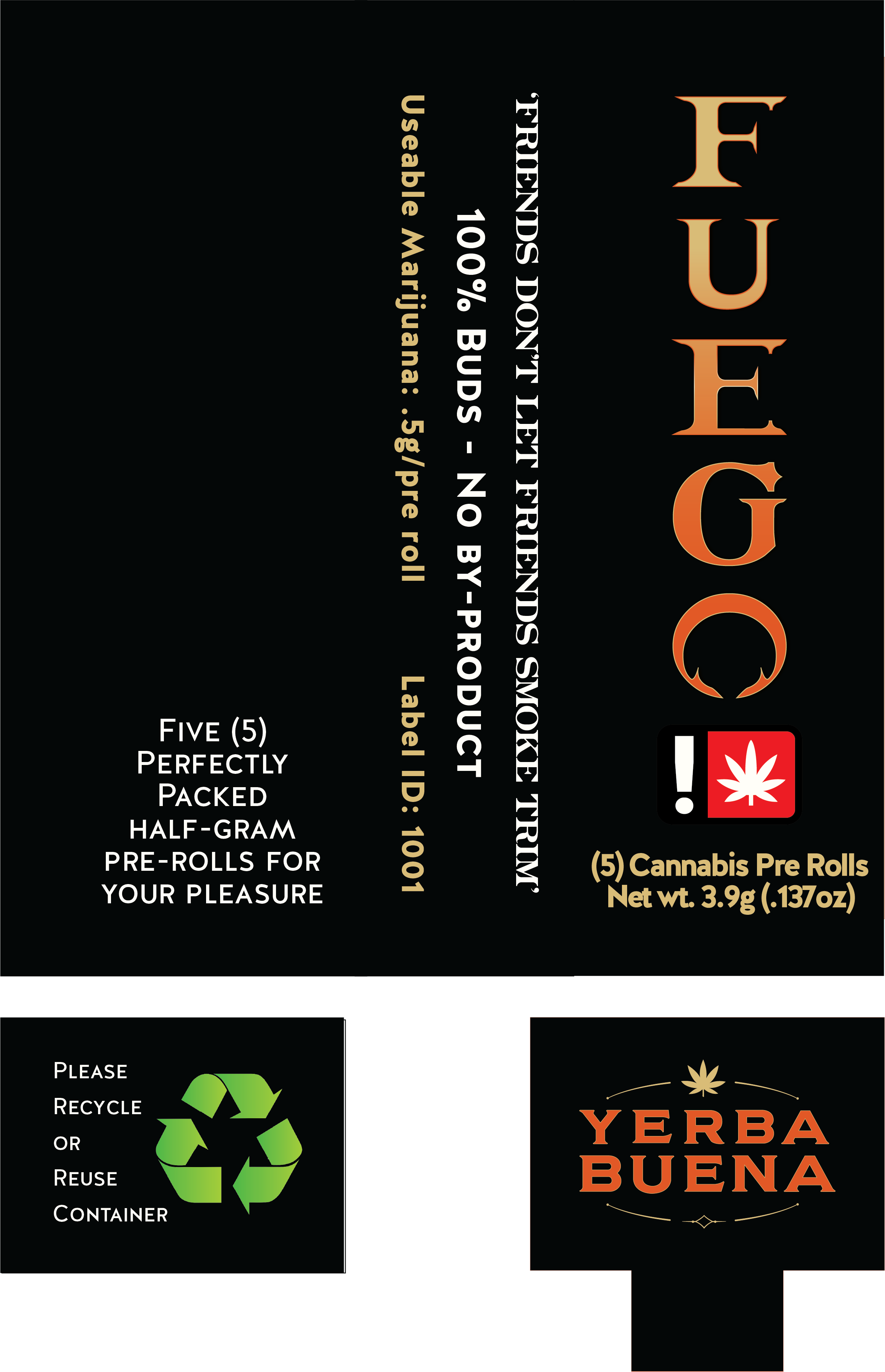
A bold minimalist design set on a black package accentuates the orange and gold colors.
Material Sourcing

Worked directly with domestic and international manufacturers to source materials for optimal cost, function, and achieve a 100% recyclable package.

A fresh product is ensured with the use of a self-sealing, bio-degradable cellulose wrap.

Additional brand recognition is achieved with the use of custom crutches.


